It is obvious that the stars in the night sky differ from one another; some look brighter, some appear larger and some have different colours.
One of the earliest ideas was that all stars are the same but they look different because they are at different stages of development: it’s as simple as the fact that some stars are younger or older than others. To test this idea, it was first necessary to measure and categorise the differences.
Star brightness is so obvious that it was categorised centuries ago. The Greek astronomer Hipparchus divided the visible stars into discrete groups, with numbers ranging from 1 (the brightest) to 6 (the dimmest visible with the naked eye).
Size and distance were measured next, the two being connected because a large star could look small simply because it is a long way away. Distance was determined using parallax measurements that tracked how much a star shifts against (what is assumed to be) a fixed background when observed from opposite sides of the Earth’s orbit around the Sun.
Brightness too is linked to distance because the brightest stars could either be closer or intrinsically more luminous.
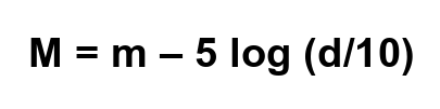
These factors are all combined in absolute magnitude, which is the brightness that each star would have if it were at the same distance from Earth. The standard distance used is 10 parsec and a star’s magnitude at this distance is linked to its apparent magnitude (which is its brightness as seen from the Earth at its true location). The equation that connects absolute magnitude (M) with apparent magnitude (m) and a star’s true distance from Earth (d) is;
Finally, there is the matter of a star’s colour, which depends on (and indicates) its surface temperature. Stars that have a blue or white appearance have a higher surface temperature than stars with an orange or red colour. This is a familiar connection as even in everyday language we talk about warm objects having a “red glow” whereas higher temperatures can be described as being “white hot”. The graph below shows how the peak of maximum brightness (dominant colour) shifts to shorter wavelengths as the temperature of the object increases.

The mathematical connection between an object’s temperature and its maximum-intensity wavelength is given by Wein’s displacement law;
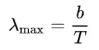
where T is measured in kelvin (K) and b is Wein’s displacement constant, which has a value of 2.9 × 10⁻³ K m
So much for the groundwork: now we need to consider whether the various characteristics of the stars (their brightness and their colour) are true differences or are due simply to different stars being at different stages of maturity in the same overall life-cycle.
This question was investigated by Hertzsprung and Russell (separately) just over 100 years ago. A short historical summary is given at the end of this article but from an examination perspective it is important to focus on the key features of the modern Hertzsprung-Russell diagram, as shown below.
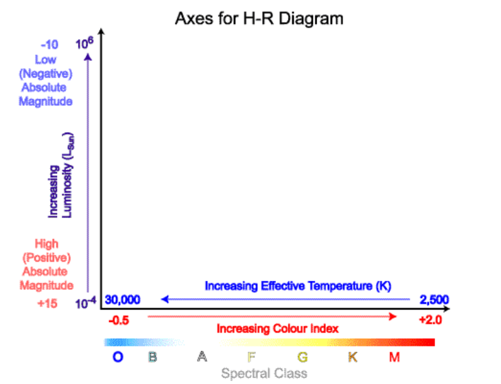
Both axes for the H-R diagram are logarithmic in order to accommodate data covering a vast range of values. The x-axis indicates absolute temperature running from about 2500 K to more than 25 000 K, increasing to the left. The y-axis indicates brightness in terms luminosity relative to the Sun and runs from about 10–4 to 106 L(Sun).
There are also alternative ways to label the axes;
- The x-axis can be marked by spectral class (OBAFGKM) in equal intervals: the option to use colour index can be ignored for A-Level physics
- The y-axis can be labelled by absolute magnitude, running from +15 (dimmest) to –10 (brightest), with positive values increasing towards the bottom of the axis and negative values at the top
As well as knowing the scales for the two axes, it is also important to be able to identify the most important regions, which are;
- the main sequence, running diagonally from bottom right to top left
- the giant region, running (roughly) horizontally in two bands above the main sequence and comprising the supergiants above the red giants
- the dwarf region, sitting below the main sequence and labelled as white dwarfs but encompassing all colours down to brown and black (note that red dwarfs are part of the main sequence so don’t belong in this progression)
These areas are marked on the diagram below.
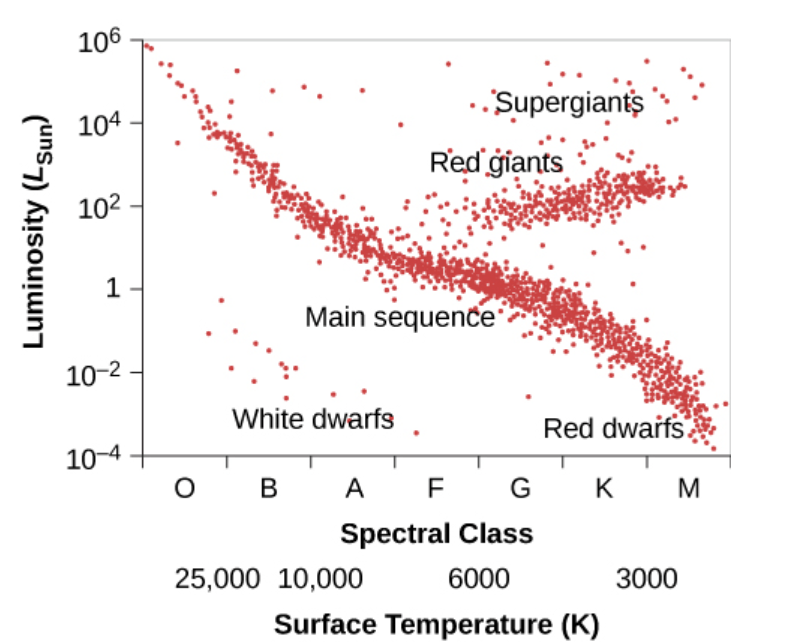
You also need to be able to identify the location of our Sun (Sol) and describe the differences between stars in the main sequence.
To find our Sun, first recall that it has a surface temperature of approximately 5500 K so it will be found vertically slightly to the right of the 6000 K marker (remember that the scale is logarithmic, shown by the fact that the 3000K and 10 000 K positions are roughly equidistant from the 6000 K marker).
Within the main sequence, lower-mass stars with lower surface temperatures and longer lifetimes are located towards the lower (right-hand) end whereas high-mass stars with higher surface temperatures and much shorter lifetimes are located towards the upper (left-hand) end. The low-mass stars are red/orange in colour but are distinguished from the (red) giants and supergiants by their low mass, which is much less than the mass of our Sun. The high-mass stars are blue or even white and are distinguished from white dwarfs by their much greater mass.
Clearly we have already answered the question about whether all stars are the same but in different stages of maturity: the answer must be “no” as stars can have a wide range of masses and they are intrinsically different in that respect.
But stars on the main sequence do all have something in common: they are all fusing hydrogen into helium. Red dwarf stars in the lower corner of the main sequence are fusing their hydrogen into helium so slowly that that have not yet (in the entire age of the Universe) been forced off the main sequence because they have not yet run out of hydrogen. Stars in the middle of the main sequence, like our Sun, will move upwards to become red giants when they start to fuse helium instead of hydrogen. They will then shed some outer material to leave a planetary nebula as their core collapses into a white dwarf that is no longer able to support any type of nuclear fusion. They will end their days getting gradually cooler, moving to the right at the bottom of the Hertzsprung-Russell diagram.
Finally, we have the stars that are in the top section of the main sequence. These stars will consume their hydrogen fuel extremely quickly (in millions rather than billions of years) then move roughly horizontally to the right of the diagram into the supergiant region. The biggest supergiants are red but others, such as Rigel (visible in the bottom-right corner of Orion) are blue. The difference in surface colour is tied to a corresponding difference in size: blue supergiants typically have a radius about 25 times that of our Sun compared with about 500 solar radii for red supergiants.
The fate of supergiant stars is to shed their outer material dramatically in a supernova event that will leave either a tiny, and exceptionally dense, neutron star or a black hole. Neither of these objects are located on the Hertzsprung-Russell diagram. The reason why black holes are missing is obvious: they emit no light so they have no magnitude. Similarly, the tiny size of neutron stars, which have a radius of no more than about 20 km, corresponds with a very faint luminosity that is off the bottom end of the y-axis scale, even taking into account their (initially) very high surface temperature.
That completes a brief overview of the Hertzsprung-Russell diagram as required for A-Level physics but there is much more to the development of what is probably the single most important diagram in astrophysics. A few highlights of this story are given below.
A brief history of the Hertzsprung-Russell Diagram
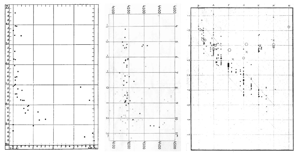
Work attempting to link stellar brightness and temperature was first brought to fruition by Ejnar Hertzsprung in 1908, while he was still a keen amateur astronomer. Hertzsprung travelled to Germany, from his native Denmark, to visit Karl Schwarzschild (famous for calculating the radius of a black hole’s event horizon) who encouraged him in his work. Also known to Schwarzschild was Hans Rosenberg, whose paper of June 1910 was the first to be published featuring a graph of star brightness and temperature. Hertzsprung’s own graph followed in 1911 (his 1908 paper had tables of data but no graphs). In 1914 a paper authored by the established American astronomer Henry Norris Russell was the first to feature a graph that can be recognised as an early version of the modern form.
In each case, the author suggested a relationship between luminosity (absolute magnitude) and temperature (represented by stellar class or other spectral measurements). This type of graph was initially known as the Russell diagram but later became the Hertzsprung-Russell diagram, recognising the chronology of its primary contributors. I don’t know why Rosenberg missed out: maybe it was because his format was similar to Hertzsprung’s (he even refers to a forthcoming analysis by Hertzsprung in his paper).
An illustration containing the first plots published by Rosenberg (1910), Hertzsprung (1911) and Russell (1914) is shown below for comparison.
Further reading
Although I couldn’t find any English translations of Hertzsprung’s papers (1908 or 1911) there are some great online resources that reveal some interesting details of the story behind the Hertzsprung-Russell diagram. In addition to the original sources mentioned in the illustration caption above, I particularly enjoyed (and recommend) the following;
an English translation of Hans Rosenberg’s original German paper of June 1910 (https://www.leosondra.cz/en/first-hr-diagram/)
an analysis of Russell’s work, including the part played by Annie Jump Cannon and others (https://arxiv.org/pdf/1302.0862.pdf)
a short account of various contributions to the H-R diagram (https://www.lindahall.org/about/news/scientist-of-the-day/ejnar-hertzsprung/)
an in-depth review of pre-1900 work that provided the foundations later papers (https://www.researchgate.net/publication/356842461_A_Hertzsprung-Russell_diagram_for_the_nineteenth_century)
step-by-step explanation of the H-R diagram by Michael Richmond (Rochester Institute of Technology) with some great links to other resources (http://spiff.cis.rit.edu/classes/phys370/lectures/hr/hr.html)
