
The concepts of specific heat capacity and specific latent heat are nicely illustrated in phase-change diagrams. But how realistic are the diagrams that are commonly seen online? The answer, perhaps surprisingly, is “not very”.
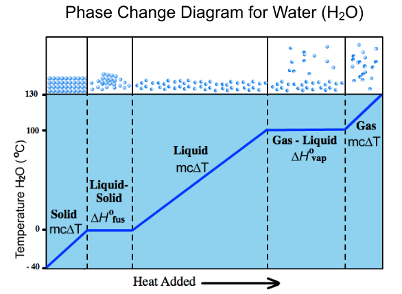
The phase-change diagram shown below is useful in terms of the amount of information it provides but, in common with many other phase-change diagrams, its proportions are wrong. Maybe this doesn’t really matter given how much valuable information is conveyed…
… but there is definitely a case for investigating the shape of a correctly scaled phase-change diagram.
The issue is that, in the diagrams of the sort shown above, water appears to spend the most time in its liquid phase when being heated from ice through to steam. In fact, the stage that requires the most energy to complete is vapourisation of the water into steam.
Before looking at a correctly scaled phase-diagram, it is worth explaining how such a diagram can be obtained. The answer is to assume that a certain mass of ice is to be heated (let’s say 1 kg) and to use a heater of a given power so that we know how many joules will be transferred to the ice (then water, then steam) every second. This value can be put sequentially into values for; the specific heat capacity of ice (2.09 kJ/kg K), the latent heat of fusion for water (330 kJ/kg), the specific heat capacity of water (4.18 kJ/kg K), the latent heat of vapourisation for water (2160 kJ/kg) and finally the specific heat capacity of steam (1.85 kJ/kg k).
Using these values (see footnote) to get a scale drawing, we discover that the shape of the phase-change diagram for water is actually as shown below.
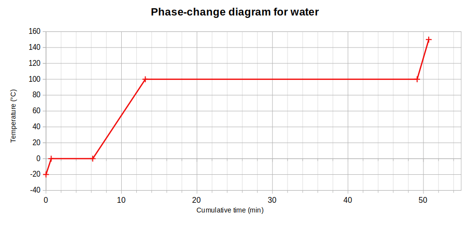
Why does this matter? Firstly, in an era of climate-change awareness, it reveals how shockingly little energy is needed to raise the temperature of ice: this figure is around half the value for warming water so it is clear to see that global warming will melt ice much more quickly than it will warm ice that has already become water.
In a similar vein, the scale graph also shows that an enormous amount of energy can be transferred unnecessarily when a kettle or pan of water is allowed to boil. We saw this in the lab when we used an immersion heater to boil water that had previously been heated to its boiling point: the mass loss (due to vapourisation) was very small, particularly when compared with the mass of ice that was melted in the same amount of time using the same heater.
On the subject of mass loss from a liquid, it is important to remember that mass will be lost even when the liquid is far below its boiling point. This is explained by evaporation that occurs at all temperatures, whereas boiling occurs only at the liquid’s boiling point. In the classroom, we measured the room-temperature mass loss from a 250 ml beaker to be 3.6 g over a period of 20 hours, which equates to about 0.2 g per hour.
As an exercise in experimental thinking, you are encouraged to consider how the rate of evaporation would change if the same volume of liquid were poured into a measuring cylinder or a large Petri dish. What sort of mass loss, compared to the beaker, would you expect from these two containers – and why?
That question is unlikely to appear in an AQA Trilogy examination paper but you could be asked to calculate the overall temperature change for a given mass of ice that is provided with enough energy to raise the ice to its melting point, then to melt the entire sample and have energy remaining to heat the water to a certain temperature. In fact, there was a question in the November trial examination that was based on exactly this combination of processes!
If you feel like testing yourself on this skill, then use the specific heat capacity and latent heat values given above to predict the maximum possible temperature of 1 kg of water that started as ice at -10 degrees Celsius if the increase in total internal energy was 525 kJ. To make life a little easier I will tell you that the answer is close to 40 degrees Celsius: you just need to tell me the exact final temperature. Give your answer to three significant figures!
FOOTNOTE: It’s worth saying that you may find slightly different values online from those that I have used for my graph. In particular, the specific heat capacity of steam varies considerably depending on the temperature and pressure of the steam. But for our GCSE course, we will assume that single values are sufficient.

One thought on “Phase-change diagrams”