
Graphs are a great way of presenting information in a format that is easy to understand but it’s important you can describe them accurately as this skill is commonly tested in GCSE Physics papers and it ought to be an easy way to accumulate marks.
I recommend a three-step approach, as outlined below.
1. Always start by describing the overall trend… Does the graph show positive correlation (both variables increase) or negative (one variable increases as the other decreases)?
2. Then state the general shape of the line… Is the line straight or a curve? And if it is a curve, does it contains a hump (maximum) or dip (minimum). It’s worth adding that these features are both correctly known as turning points but that vocabulary isn’t in the GCSE Physics course.
3. Finally, add some detail…
3(a). If the line is straight and goes through the origin then the values of the two variables are directly proportional to each other. This means that when one variable doubles, so does the other. You should identify a couple of pairs of values (coordinates) to prove this is true.
3(b). If the line is straight but doesn’t go through the origin then be sure to state the intercept value. If possible, try to explain (suggest a reason) for the non-zero intercept. For example, on a graph that shows the length of a spring as increasing amounts of mass are suspended from it, the intercept corresponds with the natural (unstretched) length of the spring.
You may be given a graph that contains two lines. In this case, describe each line individually, using the three-step approach given above, then highlight differences between the two lines.
Let’s look at a few examples, starting with some single-line graphs. (Note that the word “line” covers both straight lines and curves.)
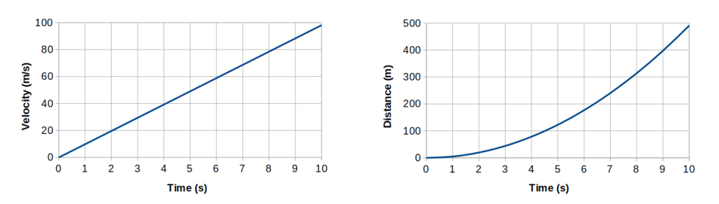
In the graph on the left, as time increases the velocity also increases. The trend line is straight and goes through the origin. This shows that velocity is directly proportional to time. When the time doubles, the velocity also doubles. When the time is 2 s, the velocity is 20 m/s. When the time doubles to 4 s, the velocity is 40 m/s, which is double the velocity for 2 s.
In the graph on the right, as time increases the distance also increases. The trend line is a curve that gets steeper as time increases. This means that distance is going up at a faster rate than time. When the time is 3 s, the distance is just under 50 m. When the time doubles to 6 s, the distance is about 175 m, which is much more than double the distance for 3 s.
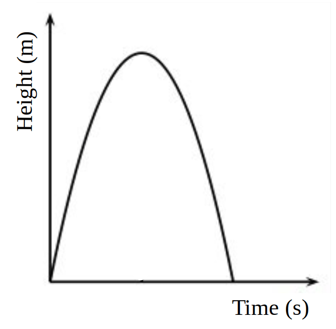
Although the graph above has no scale marked, you can still describe the relationship between the two variables… As time increases the height first increases then decreases. The trend line is a curve that has a peak at its mid-point.
Now let’s look at graphs with two lines…
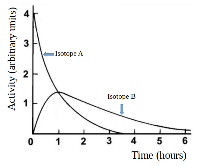
Have a go at describing this graph yourself. Describe the line for Isotope A first, then the line for Isotope B. Once you have done that, add a comment comparing the two lines. In particular, look for any special points, such as where the two lines cross.
When you have written (or carefully thought about) your own answer, click on this link to view the model answer and explanation.
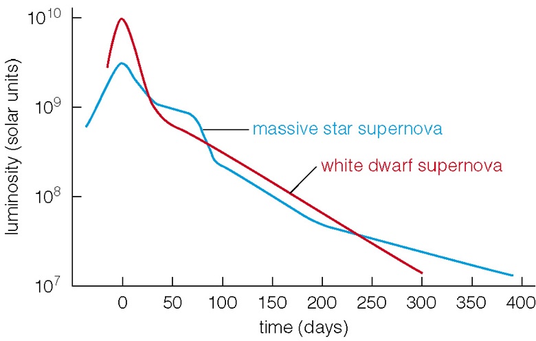
For a bit more challenge, have a go at the graph shown below. If you want the model answer for this graph, you’ll have to come and ask me in our next lesson! That way, I’ll know you’ve read this post and used it as part of your revision. And if you just want to talk about stars, galaxies, black holes and the fate of the Universe, that’s fine too!
Postscript (updated January 2022): I added the following activity to this article shortly after it was written but the source is now behind a paywall. Rather than removing the link, I’m leaving it here is case the paywall gets lifted…
I’ve just found a really nice activity from the New York Times that gives you the chance to apply graphing skills in a real-life (non-physics) situation. This is important because the skills we learn while studying sciences are often very useful in other areas of activity, so please don’t think that physics is just about physics!
The NYT context is the relationship between average household income and the chances of children in that family going to college. The activity asks you to predict what shape you think the graph might have: you can draw any sort of curve (including a straight line with any gradient). A “free tip” is provided, revealing that the curve must go through a certain point. And when you’ve predicted your own curve, you’ll get to find out the true answer and read an explanation about the data. It’s a great resource and you can find it at https://www.nytimes.com/interactive/2015/05/28/upshot/you-draw-it-how-family-income-affects-childrens-college-chances.html
